The Federal Highway Administration (FHWA) Standard Alphabet Series E Modified used on green highway signs has been the official typeface of the United States Highway System for over 80 years. This ubiquitous, quirky, and at times maligned typeface met the need for road signage that quickly and effectively provided critical information to drivers traveling at high speeds. They are referred to as the Standard Alphabets rather than as a typeface, as the letters were designed by engineers outside the traditions and sensibilities of typography.
The Standard Alphabets include a series of widths, from the narrowest Series A to the boldest Series F. Series A has been discontinued as too narrow to be legible at high speeds. Originating in the mid 1930s, these alphabets are the product of rigorous testing and development to make the first standardized signage system for U.S. roadways.
1935 The Rounded Upper Case
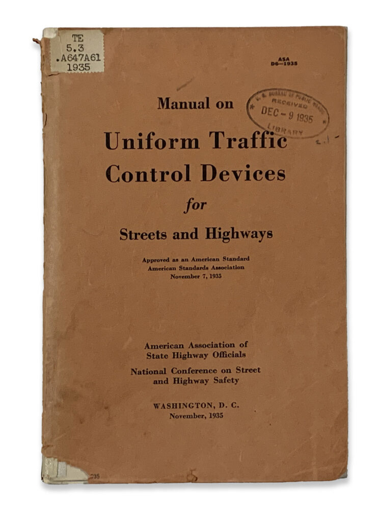

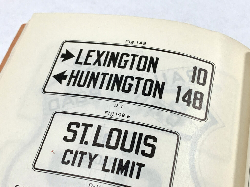
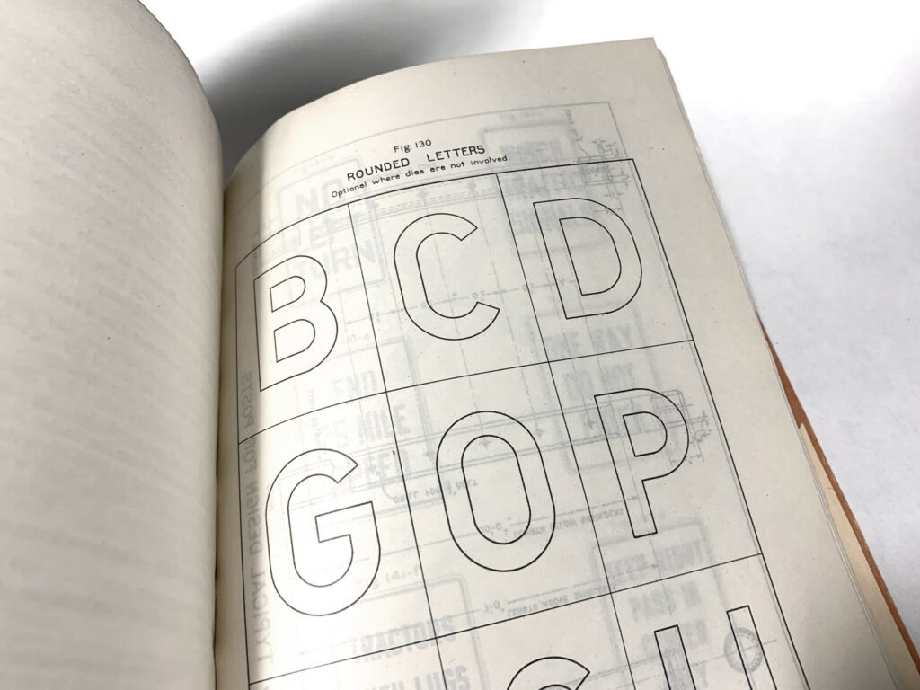
The uppercase alphabet was introduced as an option for signage in the 1935 Manual on Uniform Traffic Control Devices (MUTCD). The MUTCD established a national legal standard for signs, signals, and markings to ensure consistency across all public and private roadways. By standardizing the design and placement of these devices, the manual enhances safety and mobility for all users while reducing manufacturing and maintenance costs. Adherence to these guidelines is mandatory, as non-compliance can lead to the loss of federal funding and increased legal liability for agencies.
1943 The Pentagon Road Network
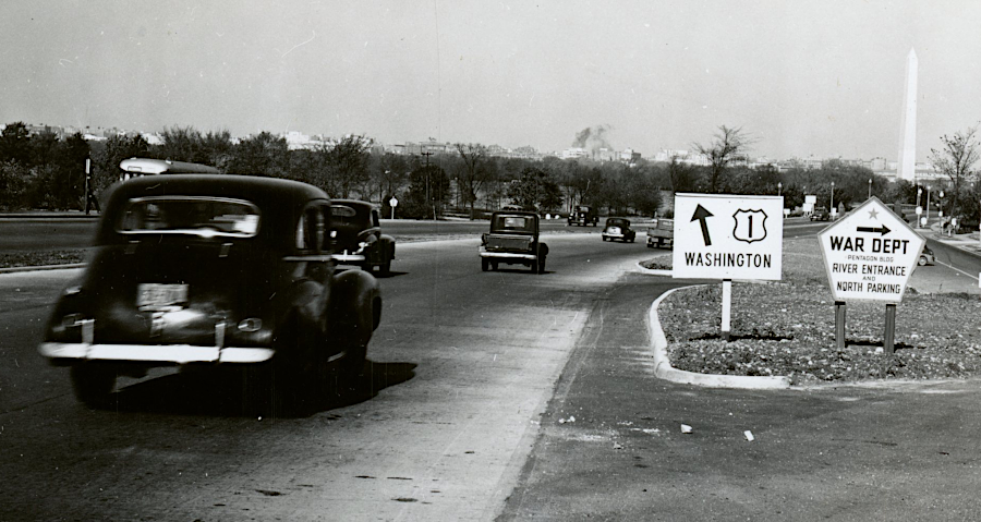

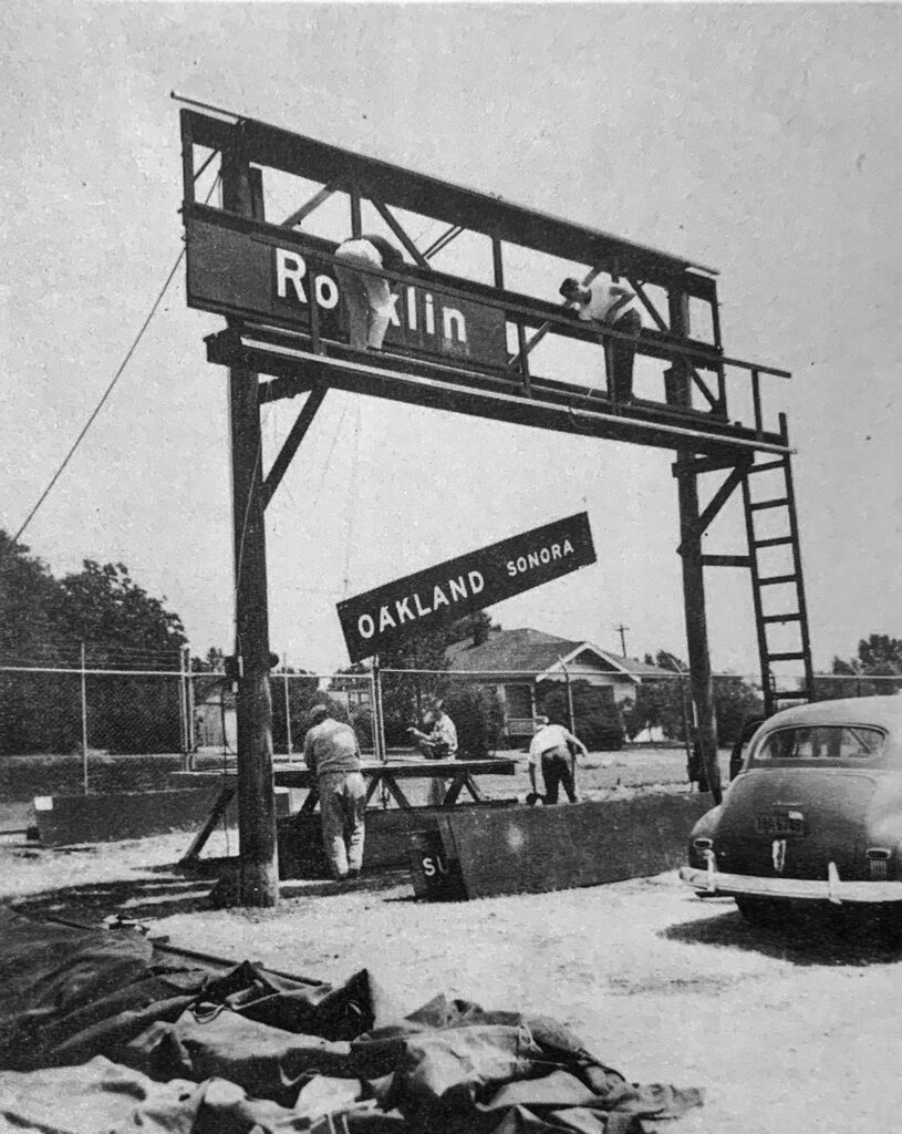
The Pentagon Road Network, constructed in the early 1940s, served as the critical testing ground for the first systematic use of the rounded standard alphabets that would eventually evolve into the national highway standard. Engineers moved away from the blocky lettering of the previous decades in favor of a rounded geometry, an early version of the FHWA Series.
The Pentagon Project featured a fully developed set of rounded upper case letters in Series B, C and D. These letter forms are the precursor to the Standard Alphabets published in 1945.
1951 The Forbes Lower Case Study
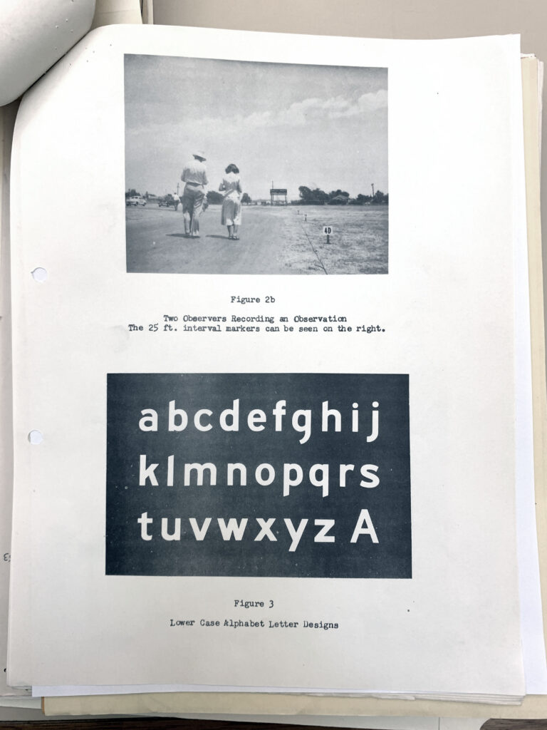

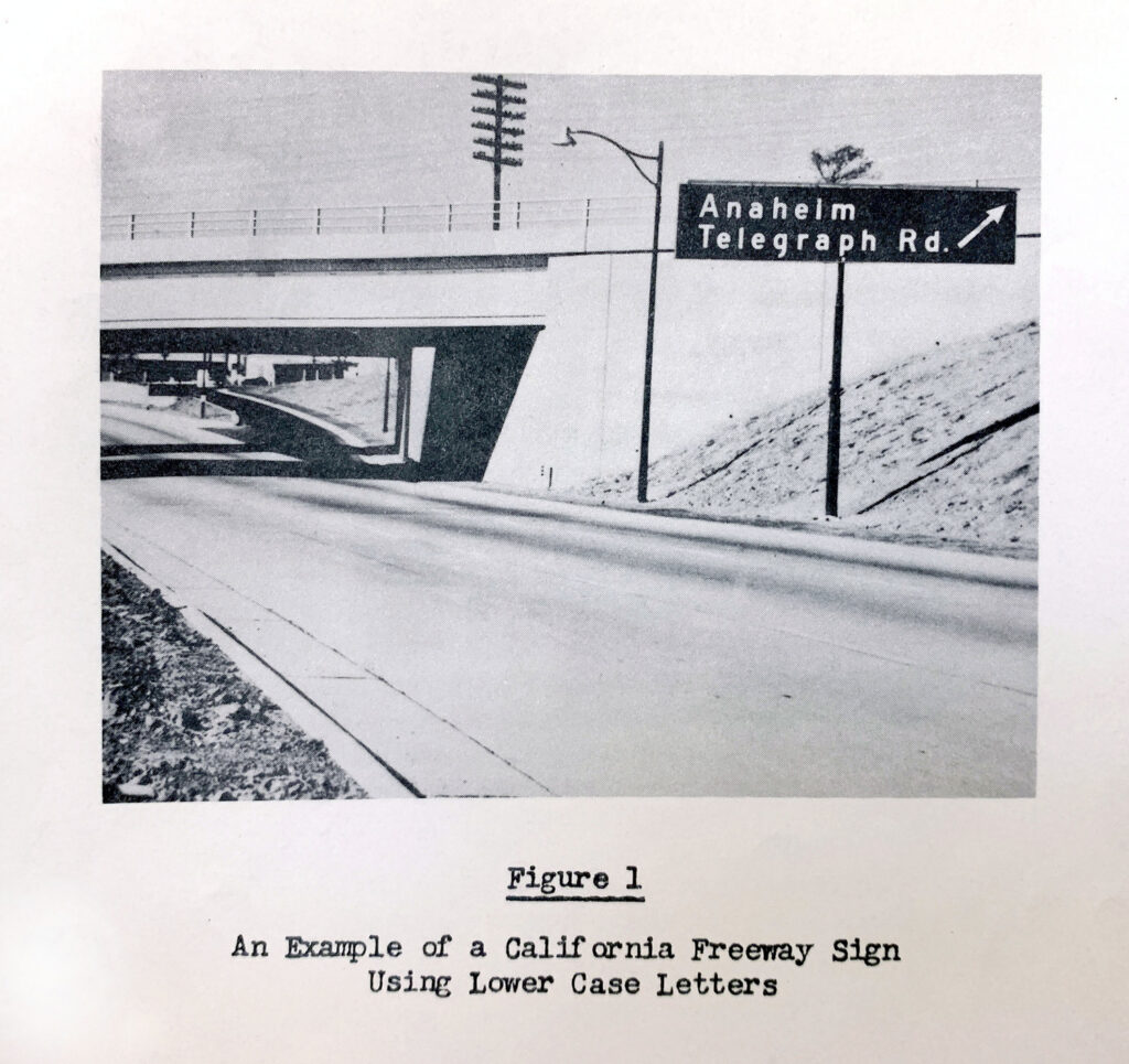
The lowercase alphabet appeared in T.W. Forbes’ original manuscript delivered to the California Division of Highways. These lower case letters were already in use in California, and would be adopted by other states before becoming standard fifteen years after the study.
H.E. Hilts, Public Roads Administration, 1947The rounded lettering for highway signs, approved by all the sponsoring agencies in 1945, is specified for all signs. Tests of these letters, made by the Ohio Department of Highways and the Public Roads Administration, have shown them to be more legible than former more angular letters.
1952 Standard Alphabets
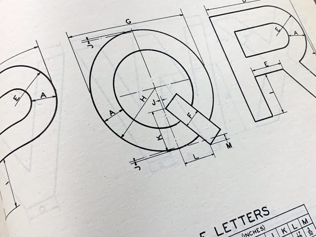
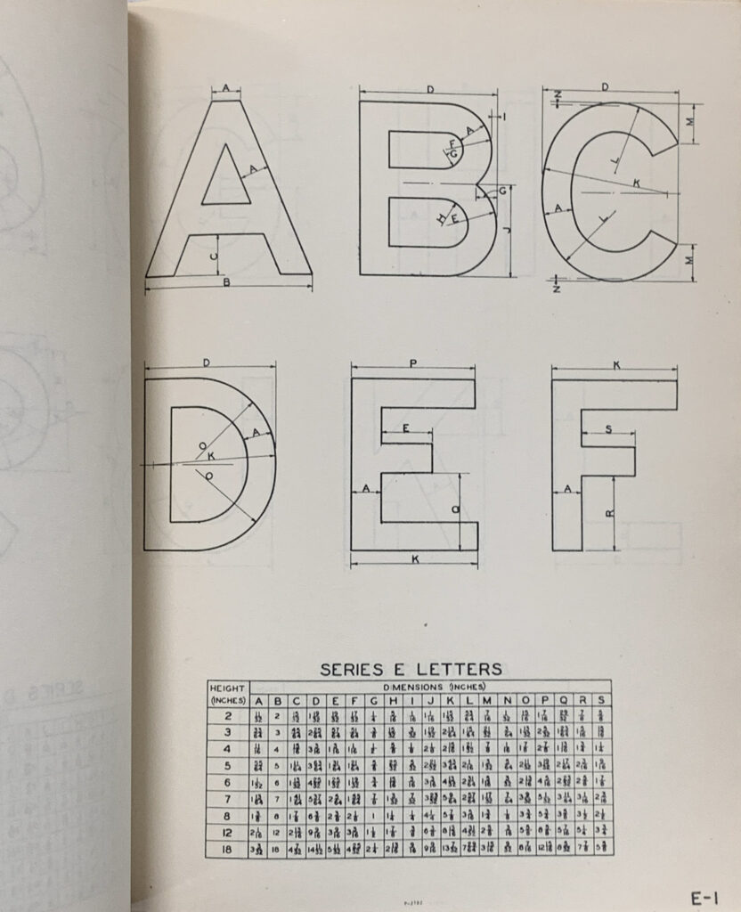
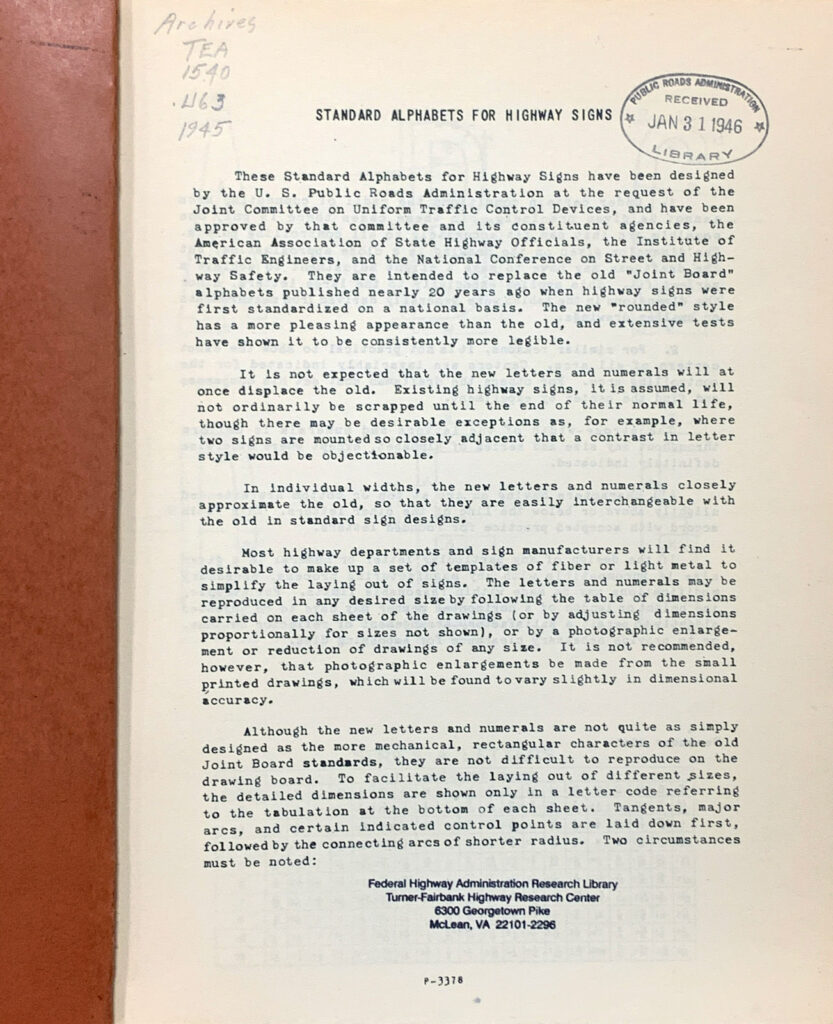
In the time before digital printing, each letter had to be made by hand using the measurements provided. The Standard Alphabet upper case rounded letters first appeared in the 1935 MUTCD as an option, while the lower case was introduced in 1957 and officially adopted in 1966.
The 1945 book contains explicit instructions for local highway departments to reproduce the letters and signs and make wooden or metal stencils. Sign makers consulted charts to determine stroke widths and other letter dimensions, sometimes down to fractions of an inch.
1958 Highway Signs Go Green
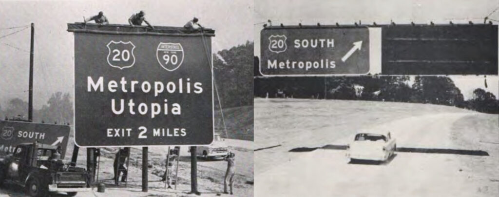
In 1958, highway engineers conducted a color test for highway direction signage on a two-mile unopened section of the Capital Beltway in Greenbelt, Maryland. The researchers mounted massive signs with identical white reflective text on green, blue, and black backgrounds, using fictional destinations Metropolis and Utopia to test recognition at speed. These experiments proved that white text on a green background offered the best legibility and the least irradiation, or visual blurring, at night. That led to the official adoption of green for the Interstate Highway System.

1966 Upper & Lower Case
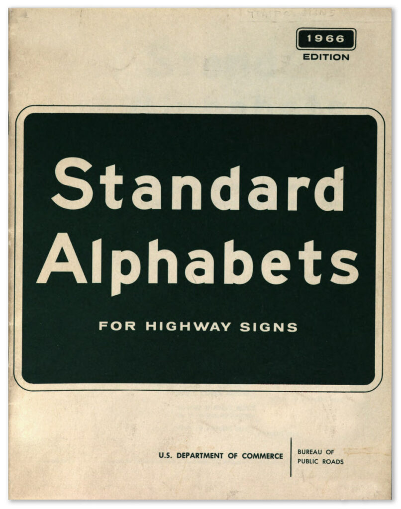
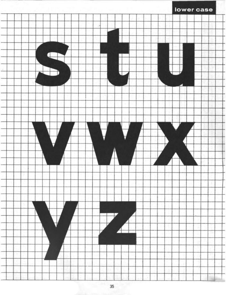
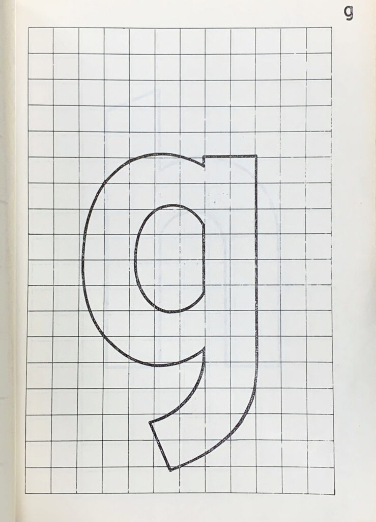
The 1966 edition of Standard Alphabets reveals a complete system of letters based on the California system, ready and refined for implementation. These letters were no longer compass-and-ruler instructions, but had been gridded for photographic reproduction. The lowercase and capital letters were published together in this guide in 1966. It took fifteen years after T.W. Forbes conducted his landmark visibility tests using lower case letters for them to be adopted. California and other states used the Forbes letters in the intervening years, but this document marks their official acceptance into national standards.
Anatomy of the Standard Alphabet
Cap height to loop ratio was set at 1.33 to 1. In other words, the height of the capitals is 33 percent larger than the lower case x-height. For example, nine-inch capitals would have six-inch lowercase. Details like angled terminals, small counters, and abrupt transitions from curve to stem reveal the ruler-and-compass origins of the design.